Categories
Final Project

Annapolis to Roanoke: The Troubled Naval Voyage of the Burnside Armada

The Movement of General Burnside’s Armada

http://bit.ly/1vWDVP6

When I started this project, I knew I wanted to talk about Linn’s naval travel, but I was unsure about what specific aspect would be most interesting. My research question was how did naval warfare effect the way that the Civil War was fought, and how did the weather, tides, wind, and other nautical issues effect the way that the war played out. The answer, however, was hidden deeper than I expected. In order to start teasing out the answers to those questions, I began to read through both the Linn diary from January 6th to February 1st and the 3rd and 4th chapters of the Burnside Diary, highlighting things that were related to naval movement, a struggle that they faced while on the water, and anything that I thought could be added to my map to further my story. Both accounts go into incredible detail about the terrible struggles they faced while on these ships, and my fear changed from not knowing what to talk about to not knowing how to pick out the best information and represent it on my map. My next issue was going to be finding what could be depicted as text and what could be added as visuals. After highlighting some sections of all of the texts, I went back through and changed the color of highlighted sections to green that I thought could be represented with symbols on my map.

A sample of my highlighting of the journal

As I continued to do this, I complied a sort of relative timeline, which was, at its core, chronological, but at the same time was not necessarily linear. I found that although information may not be grouped together in the journals, adding it together on my map would allow better understanding of how issues related to nautical travel harassed them during their passage. After moving all of the information from the highlighted journals to the progression of the story that I wanted to tell, I found that I had both information that was clumped linearly and information that went together best when pulled from different areas and presented together.

An example of non-linear information that helps my story when clumped together
An example of non-linear information that helps my story when clumped together. In this case, issues caused by large waves
An example of a section of my linear timeline, where it made sense to present the data chronologically

Unable to find a true ending in the information that I had, I decided to continue on in the Burnside Biography, reading the 4th chapter, when I had initially intended to just use the 3rd, and decided that the perfect ending for my story was when they disembark from the Cossack and arrived at Roanoke. Then, I went onto my map and went through my new “storyboard,” adding map notes in places where I thought they would better represent an ideal better than just pure text. I broke these up into several different layers so that I could isolate the notes that represent different types of events, obstacles, and movements.

The different layers of my map notes

Then, I started to move the rest of my story into the panels, while trying to connect the images on my map to the writing on the panels. As I continued to work, my idea of how I was going to represent my story changed again, and I put different pieces of information where I thought they fit best, not necessarily where they landed in the story. After looking over what I had added and what I had left out so far, something that I found that I had not added were a lot of the direct quotes from the journal. Although I had used these quotes as evidence for some of the text in my side bar, I thought that adding the first hand perspective of these soldiers would strengthen my argument. In order to do this in a matter than continued my exploration of combining visual and textual aspects, I decided that the best place to include these quotes was in the bubbles of the map notes. By adding the quotes to these notes, I hoped to allow the reader to draw a deeper understanding of both what these visuals truly represented and how they connect to the writing in the side bar.

An example of the link between my quotes and writing
An example of the link between my quotes and writing.

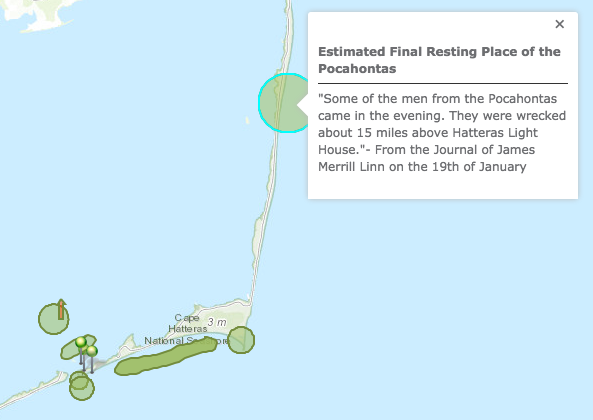
The quotes also proved helpful in other ways, as the combination of quotes, historical maps, and the distance indicators on the charts allowed me to estimate several locations, such as the wreckage of the Pocahontas. In the journal, Linn describes the wreckage to be 15 miles above the lighthouse, so using the distance measures on the chart I literally used a note card to measure out 15 miles and guess where the wreckage could be.

An example of how quotes helped me create links to visuals

Because I had to estimate a lot of the locations, using bubbles and free form areas seemed like the best option because it allowed some error in my approximations. The intersection of visuals and text turned out to be one of the hardest aspects, as representing a complex story through multiple different outlets is never easy. As things began to come together, I looked back over what I had done to see if I thought it presented my story well. Although I do believe that there are some limitations to the ArcGIS software, I think that there was no other medium that could present my story in a better way. By integrating visuals and text, I was able to show the audience the movement of the ships, key points of interest, projected locations of different anchorages, wrecks, and lighthouses, as well as explaining the story of the armada and the struggles they faced. A perfect example of this integration is my work on the “swash,” which was represented with a combination of quotes, map notes, text in the side bar, and an additional historical chart.

Screen Shot 2014-12-16 at 2.45.46 PM
An example of how the integration of text and visuals allows for a deeper understanding

Although all of this process may seem important, the building blocks of what of my successful story erupted from the storyboarding process. By laying out what I wanted to say, it allowed me to see all aspects of my thoughts, and manipulate them in the easiest way for my audience to understand. The image that my work had created said less about how naval warfare affected the Civil War as whole, but endless information on how the natural struggles of naval travel inhibited the travel and success of Burnside’s armada, and additionally, how the weather and its associates, such as wind, current, tide, waves, and fog, affected their movement and the advance of the armada as a whole. The data projected a story about nature, whether it be the land itself or the weather, and its effect on travel, and less about the war and the actual battles. The ships constantly had to stop sailing because of thick fog, lost contact with each other due to heavy winds and large waves, and in some cases, the ships were wrecked due to any number of reasons including being stuck on sand bars because of wild tides, thrown into each other by waves, and having water overflow over the sides while in the valley between waves. The Civil War was a dangerous era in naval travel, mostly because of the lack the technology we have today, and the Burnside Armada would have faced issues even in the most spectacular of weather. However, because they faced one of the worst storms in years, the struggles associated with naval travel were increased exponentially. This project allowed me to foster a deeper understanding of both naval travels during this time and how drastically weather conditions can alter the success of a voyage.

Bibliography 

Foster, John G. Sketch Showing Route of the Burnside Expedition [to Roanoke Island, N.C., February 6, 1862]. Digital Image. Digital image.Library of Congress. Washington, Government Printing Office, 1866. Web. 12 Dec. 2014. <http://www.loc.gov/resource/g3901s.cw0317120/>.

Hatteras Inlet Map. Digital image. Sons of the South. N.p., n.d. Web. 12 Dec. 2014. <http://www.sonofthesouth.net/leefoundation/civil-war/1862/february/hatteras-inlet-map.htm>. I found this map inside of a Harper’s Weekly Civil War newspaper from February 15th, 1862.

Linn, James Merrill. Diary. January 6th– February 1st 1862. MS. Bucknell University Archives and Special Collections, Lewisburg, PA.

Major-General Ambrose E. Burnside and the Ninth Army Corps: A Narrative of Campaigns in North Carolina, Maryland, Virginia, Ohio, Kentucky, Mississippi and Tennessee, During the War for the Preservation of the Republic. Chapters 3-4. Augustus Woodbury, 1866

“Map of the North Carolina Coast.” Extract from Harper’s History of the Great Rebellion, Feb. 1862, p. 243. University of North Carolina at Chapel Hill. http://dc.lib.unc.edu/cdm/singleitem/collection/ncmaps/id/887/rec/26

United States Coast Survey. Preliminary Chart of Hatteras Inlet, North Carolina. Digital image. Library of Congress. N.p., 1862. Web. 12 Dec. 2014 <http://www.loc.gov/resource/g3902h.cw0316700/>.

Categories
Blog #5

Mapping and the Battle of Roanoke

Although it took my a while to understand the program and how it all works, i found mapping to be incredibly useful and it allowed me to pull out a deeper understanding of what my diary entry truly means and how it connects to the war. Mapping itself is a very useful tool, and the ways that we utilized ArcGIS was very interesting. Although it took my a while to understand all the features, it allowed me to create a more interesting and compelling final product. Mapping allowed me to see what my diary was talking about in an easier context, by showing the course of the battle and his movements on an historical map. My mapping assignment allowed me to directly understand what effect my individual entry had on the war. Once i saw the historical map that was geo rectified on the the larger map, i was able to dissect my entry and see how his movements played out. Although it was hard for me to make conclusions from the basic writings of his diary, pulling out key phrases was what helped me in the long run. Little comments such as “He said he had been in pineswamp, but this was worse” and “Here we had to wade a pond up to our middle,” allowed me to make conclusions about where he moved around the map. GIS allows people to make a “more complicated story than traditional methods allowed,” (Bodenhamer) and thats exactly what i tired to do with my map. By combining the historical map and the entry, my story became stronger.

Looking at the historical map, a few things stuck out to me. My map notes below are without the historical map underneath it because it does not show up on my laptop, so i will have to explain. The battery image that comes up on the map is almost identical to the hand drawn sketch from Linn, as well as the location of the swamp in correlation to how he talks about his path to the battery. Although it may have seemed easy to me, its important to realize how perspective plays into all this. As Bodenhamer says, “the same body of water flowing in a channel may be called a brook, stream, or river.” This quote shows the importance of perspective, and it is important because someone else may have interpreted Linn’s writing in a different way from me. I made conclusions about the pineswamp and the pond, but they were not specifically talked about in the diary. Because of this, someone else may look at his path differently than i did.

Screen Shot 2014-11-19 at 5.37.57 PM
my map notes without the historical map
Capture
the battery from my entry


All in all, the practice of mapping allowed me to gain a deeper understanding of the way that Linn records history and how maps can help us gain a better understanding of how history works. By using this software, i was able to figure out “what happens in a geographic space” (Bodenhammerr), which in my case, is the island of Roanoke and specifically my battle field.  Just by looking at the historical map and re reading my diary, i was able to make incredible conclusions about my entry. Mapping for me was useful and interesting, and i think that it is something that i would be interested in pursuing as a final project if i found information that fit well into a mapping situation.

http://bit.ly/1EVI9O8

Above is the embedded code to my map

Categories
Blog #4

What I Learned From Tagging

Learning how to mark up our documents and then taking what we learned and applying it to our journal entires has allowed me to obtain a deeper understanding about the way that Linn writes about the war. Although the process was tricky and frustrating at points purely because of my lack of experience, I believe that it brought focus to the specific types of things that Linn talks about when he is writing. For example, when going through the version of the Google Docs that was marked up with colors, it was clear that some of the colors were used more than others. For me, I would say that blue and orange were the two most used, while purple, brown, and cyan were the least used. This comments on Linn’s writings because it gives us insight into his writing style, with a focus on people and objects. Although he is descriptive in some places, he sometimes jumps from topic to topic, which is why we see less cyan, brown, and purple.

A lot of what Pierazzo talks about in her piece was visible in our process. For example, there was a large variety in the amount of tagging that occurred, with some people tagging most words, while some just picked out the important ones.  This resonates in Pierazzo’s article when she says, “So, we must have limits, and limits represent the boundaries within which the hermeneutic process can develop”(466). One of my paragraphs is below (A), and i chose to only tag the words that I thought were important and relative.

Screen Shot 2014-10-26 at 9.21.11 PM
A
Screen Shot 2014-10-26 at 9.20.56 PM
B


Although I think i did not make a mistake in being sparse, other people heavily marked up their entries (B) which made me come to think about how they thought those words were important compared to how I choose to select my words. Again, this links back to Pierazzo when she says that a digital edition includes words and sections that are “considered meaningful to the editors” (475) and “that one cannot declare once
and for all which features should be included” (475). The degree to which each person marked up their piece was one of the most interesting factors when I looked over everyone else’s entries.

Screen Shot 2014-10-26 at 10.09.45 PM

I also learned a lot in the editorial process, primarily that it is harder to come to conclusions on basic stuff like whether a boat is a place or object than I thought. When we were talking about the cossack and different ways to go deeper in tagging, it changed the way that i thought about this tagging and my reading. When tagging mine, i had a deep internal struggle about how to tag battery, considering that like cossack, it could be both. My struggle was the externalized when we came to class and discussed cossack. When talking about what to mark up and what not to mark up, Pierazzo says that it “depends either on the particular vision that we have of a particular manuscript or on practical constraints” (465). For me, the idea of particular vision is why we disagreed. I saw battery as an place, and when asked about cossack it made sense to me that it would be a place too. Boats represent places for me, but someone made a point that to Linn, they are objects not places, and that makes sense to me. By making it an object but adding the type boat, we were able to come to a consensus. However, considering that we spent so much time arguing over one word, it makes me dread what it must be like to go through an entire edited text. I thought that this was interesting, gave me a better look into the kinds of words and descriptions that Linn uses, and taught me some new useful skills.

Categories
Blog #3

Thoughts on TimeMapper: A Time of Progress

Chronology of events is something that has always been crucial to the understanding of any sequence. Not only does to show us what the order of events was, it provides context. Throughout my time in school, history classes from elementary school to college have used timelines as a teaching tool. Although I have never put a lot of thought in to it, knowing the order of events is crucial to understanding. Grafton says that a timeline must be “possessing a structure” or show an “order of meaning,” (Grafton 11). For me, this is the same as the context that they provide for me. It isn’t completely about finding when they happened, but more about how they fit together in time and how they show a change or some trend. He says that in his article when he says, “the form of a timeline is….. emphazing overarching patterns and the big story,” (Grafton 20). It shows what happened in the time around an event, and knowing that can help you interpret each event differently, as well as the time.

Although i love timelines, I think some of the visuals on TimeMapper are tough to deal with and that the website could be switched around. It is hard to see all the events spread out, which would make it easier to jump to stronger connections. But, after analyzing our map and timeline, i did see a pattern. A vast majority of the events that we mapped were from two distinct categories. For me i see a broad spectrum of events, but most of them shows change and i want for voices to be heard.

Screen Shot 2014-10-05 at 9.54.24 PM
A cluster of writings and inventions in Europe, which show the want for people’s voices to be heard
Screen Shot 2014-10-05 at 9.54.16 PM
the description for the death of the king


On the below, you see the description of the murder of the King of Madagascar,, which is one of many change oriented events that were on our time mapper. Other events include the murder of the King, Unification of Italy, and the Civil War. These events show a desire for change in the way the world is, with the world in a time of progress. A common theme in this time was the desire for their words to be heard, whether its the publishing of a book, or a civil war about civil rights. It is a time for change, and i think our time mapper shows that.

Categories
Blog #2

Wounded and Battle

The two words that I picked to look at were wounded and battle. I wanted to pick words that would reflect his feelings during battle and would show if the way that he talked about the battles changed overtime. Instead of picking random words, i wanted to find words that had some sort of connection, and i found that wounded and battle seemed like they could possibly have some beneficial links. When i continued to look closer, it was obvious that a link was present.

Screen Shot 2014-09-24 at 1.41.20 PM

The graph above shows the number of appearances of both of my words in the progression of his writings. The second half of his writings had dramatically more appearances of both of the words. Actually, wounded does not show up once in the entire first half of the writing, but shows up thirty four times in the second half. Battle is also used drastically more often in the second half than in the first. For me the connections between the appearance of these words could show a change in Linn. Both of the words that i picked are connected to pain, war, and conflict so i would assume they would led to a change in the way that Linn sees that. His time spent in the war made him hard, resulting in the loss of innocence which in turn led to the change in the way that he writes and what he chooses to write about.

I also found it interesting to look at the words that were connected to battle and wounded in the Links tool. They were both connected to the word company, which comments that he was often talking about his solider companions when discussing battles and the wounded. The words left, exhausted, and killed were also all in this cluster. These words all have some connotations that could play a part in Linn’s transformation. Although i would say a deeper look might be required to make a strong conclusion about his change, my dive into these two words seemed to fit that conclusion.

Screen Shot 2014-09-24 at 1.36.51 PM
Links: Connections between my words